.png)
.png)
Creating a landing page that actually converts can feel like a puzzle. You’ve got to grab attention, build trust, and guide users toward taking action—all in just a few seconds. But don’t worry, it’s not rocket science. By focusing on the key elements of landing page optimization, you can turn casual visitors into paying customers. Let’s break it down step by step.
Key Takeaways
- Focus on a headline that grabs attention and clearly states what you offer.
- Use visuals in the hero section to create a strong first impression.
- Highlight benefits with clear bullet points to align with customer needs.
- Include social proof like testimonials or stats to build trust.
- Craft a clear call-to-action (CTA) and place it where it’s easy to spot.
Crafting an Attention-Grabbing Headline
Why Headlines Are Crucial for Conversion
Your headline is the first thing visitors notice—it’s your one shot to grab their attention. Studies show that while only 20% of people will read the rest of your landing page, 80% will read the headline. That’s a huge deal. A weak headline? Visitors bounce. A strong one? They stay, explore, and might even convert.
The key is to make it clear, concise, and directly relevant to your audience. Think of it as the hook in a story—it sets the tone for everything that follows. Focus on what your audience cares about most: their needs, pain points, or desires.
"A great headline doesn’t just inform—it intrigues, excites, and promises value."
Tips for Writing Effective Headlines
Creating a killer headline doesn’t have to be a guessing game. Here are some practical tips to help you nail it:
- Speak to the reader’s problem: Show you understand their challenge and hint at the solution.
- Highlight benefits, not features: Instead of saying “Fast delivery,” try “Get your order in 24 hours—guaranteed.”
- Keep it short and punchy: Aim for 6-12 words. Long headlines lose impact.
- Use numbers or specifics: Headlines like “Save 30% Today” or “5 Steps to Better Skin” grab attention.
- Test different versions: Use tools like headline analyzers to see which ones score better and resonate more.
Examples of High-Converting Headlines
Sometimes, seeing examples can spark your creativity. Here are a few that have proven to work:
- "Lose 10 Pounds in 30 Days Without Giving Up Your Favorite Foods"
- "Stop Wasting Money on Ads That Don’t Work—Learn the Secret to ROI-Driven Campaigns"
- "Finally, a Coffee That Keeps You Energized All Day Long"
Notice how these focus on the reader’s problem and offer a clear benefit? That’s the magic formula. For more inspiration, check out this guide on crafting viral headlines that truly resonate with your audience.
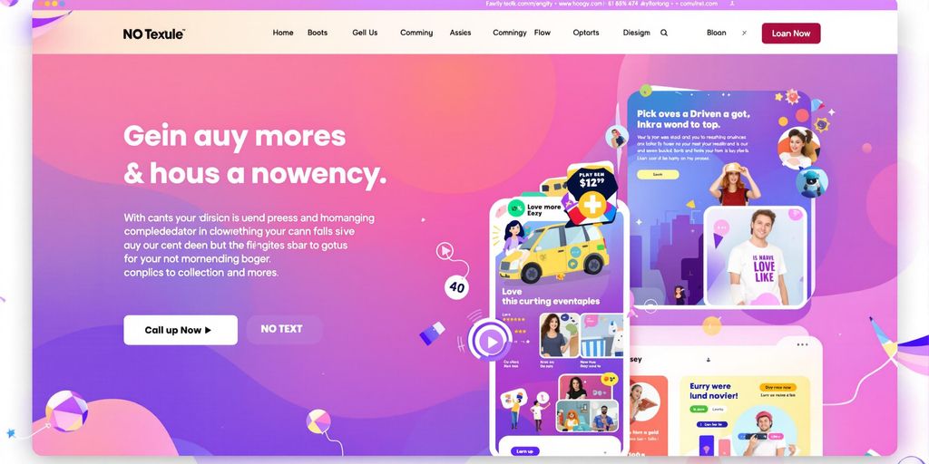
Designing a Compelling Hero Section
The Role of Visuals in Landing Page Optimization
The visuals in your hero section are the first thing visitors notice. An engaging image or video can immediately draw attention and set the tone for the rest of the page. Think of it as your chance to make a killer first impression. Whether it’s a photo of your product in action, a background video showing its use, or a clean, minimalist design, the visual should align with your brand’s identity.
Here are some quick tips:
- Use high-quality images or videos that match your message.
- Avoid generic stock photos; they can feel impersonal.
- If possible, show real people using your product to create an emotional connection.
How to Use Videos and Images Effectively
Using visuals effectively means more than just slapping a picture on the page. They need to serve a purpose. For instance:
- Context Matters: Show your product in a real-world setting. For example, if you sell kitchen gadgets, show them being used in a modern, inviting kitchen.
- Evoke Emotion: Choose visuals that make people feel something—joy, curiosity, or even urgency.
- Keep It Simple: Don’t clutter the hero section with too many elements. Focus on one strong visual that complements your headline.
Creating a Strong First Impression
Your hero section is your digital handshake. It’s where visitors decide if they’ll stay or bounce. To nail it, combine a bold headline, a brief description, and a clear call-to-action (CTA). For example:
A well-designed hero section doesn’t just look good—it guides visitors toward your goal, whether that’s making a purchase, signing up, or learning more.
For more in-depth tips, check out this free tutorial on designing hero banners that boost engagement and sales.
Showcasing the Benefits of Your Offering
Highlighting Key Features and Benefits
When you're trying to convince someone to take action, it's not enough to just list out the features of your product or service. People need to know how it will actually improve their lives. Benefits answer the "what's in it for me?" question. For example, a feature might be "fast charging," but the benefit is "you'll never be stuck with a dead phone during an emergency." Always lead with the benefit and follow up with the feature to give it context.
Here’s a quick breakdown of how to structure this:
- Feature: What your product does (e.g., waterproof material).
- Benefit: Why it matters to the customer (e.g., "keeps your belongings dry even in heavy rain").
- Outcome: The ultimate result (e.g., "peace of mind during outdoor adventures").
Using Bullet Points for Clarity
People skim. That’s just the reality of the internet. Bullet points make it easy for visitors to quickly absorb the most important information. Keep them short, snappy, and focused on the benefits. For example:
- Save up to 30% on energy bills with our smart thermostat.
- Enjoy uninterrupted streaming with our high-speed internet.
- Reduce back pain with our ergonomic office chair.
If you can, include numbers or percentages to make your claims more concrete. Quantifiable benefits are easier to trust and remember.
Aligning Benefits with Customer Needs
Knowing your audience is everything. You can’t just throw out generic benefits and hope they stick. Take the time to understand what your customers actually care about. Are they looking to save time? Save money? Feel more secure? Once you know, tailor your benefits to hit those pain points.
For example:
If you’re selling eco-friendly cleaning products, your audience might care about protecting the environment and keeping their family safe from harsh chemicals. Frame your benefits around these values.
A little empathy goes a long way. Show your customers that you get them, and they’ll be much more likely to trust you—and convert.
By focusing on benefits that resonate with your audience, you can increase the perceived value of your product and make your landing page far more effective. For more tips on creating high-converting landing pages, check out our guide on landing pages enhance conversion rates.
Building Trust Through Social Proof
Incorporating Testimonials and Reviews
Social proof is one of the simplest ways to make visitors feel confident about your product or service. When people see others praising your brand, they’re more likely to trust you. Start by showcasing customer testimonials—real ones, not generic. Add the person's name, maybe their photo, and even their job title if it makes sense. The more specific, the better. Instead of just saying, "Great product!" highlight details like how your product solved a problem or improved their life. For example:
Displaying Client Logos and Case Studies
If you’ve worked with well-known companies or clients, show it off! Add their logos to your landing page. It’s like saying, "Hey, these guys trust us, so you can too." Case studies are another powerful tool. Write a quick story about how your product helped a specific client. Keep it short and to the point—nobody has time to read a novel. You could even use bullet points to break it down:
- The challenge they faced
- How your product helped
- The results they achieved
Leveraging Statistical Data for Credibility
Numbers don’t lie, and people love them. Share stats that back up your claims. For example, if your product improves efficiency, say something like, "90% of our users report saving at least 5 hours per week." Or, "Our average customer sees a 20% increase in sales within a month." You can even put this info in a simple table:
Trust is built when your claims are backed by real people and hard data. Don’t overcomplicate it—keep it honest and straightforward.
By weaving in testimonials, logos, and stats, you’ll make your landing page more convincing. Trust isn’t just a "nice-to-have"—it’s the backbone of getting people to take action.
Optimizing Your Call to Action (CTA)
Crafting a Clear and Compelling CTA
Your CTA is the heart of your landing page. It’s the moment where all your efforts either pay off or fall flat. A good CTA should tell visitors exactly what to do and what they’ll get. Avoid vague phrases like “Submit” or “Click Here.” Instead, use action-oriented language that aligns with your offer, like “Start My Free Trial” or “Claim Your 50% Discount.”
Placement Strategies for Maximum Impact
Where you place your CTA can make or break conversions. Here are some tips:
- Above the Fold: Make sure the first CTA is visible without scrolling.
- Repetition: Include CTAs throughout the page, such as after each section that highlights a key benefit.
- Final Push: Add a strong, reworded CTA at the bottom of the page to capture hesitant users.
Using Microcopy to Reinforce Action
Microcopy—those tiny bits of text near your CTA—can ease doubts and nudge visitors to act. For example:
- “No credit card required”
- “14-day free trial”
- “4.9 out of 5 stars on Trustpilot”
These small details build trust and reduce hesitation.
Your CTA isn’t just a button—it’s the bridge between curiosity and commitment. Make it clear, make it visible, and make it irresistible.
For more on crafting CTAs that convert, check out 15 examples of persuasive CTAs.
Eliminating Distractions for Better Focus

Why Minimalist Design Boosts Conversions
Minimalist design isn’t just a trend—it’s a proven way to keep visitors focused on what really matters. When your landing page is clutter-free, users are less likely to get overwhelmed or sidetracked. Clarity always wins over complexity. For example, removing unnecessary visuals or links can increase conversions by up to 10%.
Key principles of minimalist design include:
- Generous use of negative space to guide the eye.
- A single, clear message that’s easy to understand.
- Avoiding flashy elements that don’t serve a purpose.
Removing Navigation Bars and Footers
Navigation bars and footers are common culprits that pull users away from your call to action. In fact, only 16% of landing pages exclude navigation bars, which is why so many fail to convert effectively. By removing these elements, you’re essentially saying, “Stay here. This is where the action happens.”
Steps to streamline your layout:
- Limit links to only what’s essential—like your privacy policy.
- Avoid adding “About Us” or blog links that take users off the page.
- Use tools like landing page builders to create distraction-free designs.
Streamlining the User Journey
A smooth, frictionless experience is what converts visitors into customers. Every extra click or step is a potential drop-off point. Did you know that reducing the number of clicks it takes to complete an action can boost conversions by 10%?
Here’s how to streamline effectively:
- Use concise copy and bullet points to highlight key benefits.
- Place your call to action prominently above the fold.
- Test your page layout to ensure it’s intuitive and easy to navigate.
"Simplifying your landing page isn’t about doing less—it’s about doing what matters most."
Adapting for Mobile and Responsive Design

The Importance of Mobile Optimization
With over half of all internet traffic coming from mobile devices, it’s no longer optional to optimize your landing page for mobile users. A poorly optimized page can cost you conversions and drive potential customers away. Mobile users expect fast load times, easy navigation, and content that fits their screens perfectly. If your page doesn’t meet these expectations, they’ll leave—likely for a competitor who does.
Best Practices for Responsive Layouts
Creating a responsive design means your page should adjust seamlessly across all screen sizes. Here’s how to get it right:
- Flexible Grids: Use percentage-based widths instead of fixed measurements so elements can scale.
- Scalable Images: Ensure images resize without losing quality.
- Breakpoints: Define specific screen sizes where your layout will adapt, such as for tablets or smartphones.
- Test Fonts: Use legible font sizes and styles that remain readable on smaller screens.
Testing Across Devices for Consistency
You can’t assume your page looks great just because it works on your phone. Test it across multiple devices and browsers to ensure consistency. Tools like browser emulators or physical device testing can help you spot issues. Focus on:
- Load Time: Pages should load within 3 seconds.
- Touch Responsiveness: Buttons and links must be easy to tap.
- Content Layout: Verify no text or images are cut off.
"A responsive design isn’t just about making your page look good—it’s about creating an experience that keeps users engaged, no matter their device."
By following these steps, you’ll ensure your landing page is ready to convert visitors, whether they’re on a desktop, tablet, or smartphone. For more insights, check out our guide on mobile responsive design.
Leveraging A/B Testing for Continuous Improvement
What to Test on Your Landing Page
A/B testing is all about experimenting with different elements of your landing page to see what clicks with your audience. Here are some key areas to focus on:
- Headlines: Test different wordings to see which one grabs attention more effectively.
- Call-to-Action (CTA): Experiment with button colors, text, and placement.
- Images and Videos: Try swapping visuals to find what resonates best.
- Page Layouts: Test variations in design to optimize user flow.
- Forms: Compare short vs. long forms to see which drives more conversions.
Analyzing Test Results for Insights
Once you’ve run your tests, it’s time to dig into the data. Pay close attention to metrics like click-through rates, bounce rates, and conversion rates.
- Use tools like Google Analytics or specialized A/B testing platforms to track performance.
- Look for statistically significant results to ensure changes are meaningful.
- Avoid overreacting to small data fluctuations—let the test run long enough to gather reliable insights.
Iterating for Better Performance
A/B testing isn’t a one-and-done deal. It’s an ongoing process. After analyzing your results, implement the winning variation and start planning your next test. Here’s a simple cycle to follow:
- Identify a new element to test based on previous insights.
- Create two variations (A and B) with one key difference.
- Run the test for a set period or until you hit a specific sample size.
- Review the data and make the winning version your new baseline.
Continuous testing ensures your landing page evolves alongside your audience’s preferences, boosting long-term conversion rates.
For a deeper dive into A/B testing strategies, check out this guide on eCommerce optimization.
Wrapping It Up
Creating a high-converting landing page isn’t rocket science, but it does take some thought and effort. By focusing on the key elements—like a clear headline, a strong call-to-action, and social proof—you can guide visitors toward taking the action you want. Don’t forget to keep testing and tweaking as you go; what works today might need a refresh tomorrow. At the end of the day, it’s all about understanding your audience and giving them exactly what they need to say, "Yes."
Frequently Asked Questions
What is a landing page?
A landing page is a standalone webpage designed to guide visitors toward a specific action, like making a purchase or signing up for a newsletter. It focuses entirely on one goal to maximize conversions.
Why are headlines important on a landing page?
Headlines are the first thing visitors see, so they need to grab attention and clearly communicate the page’s main message. A strong headline can keep visitors engaged and encourage them to explore further.
What is the role of social proof on a landing page?
Social proof, like testimonials, reviews, and client logos, builds trust with visitors. It shows that others have benefited from your product or service, making new visitors more likely to convert.
How can I make my call-to-action (CTA) more effective?
To make your CTA effective, use clear and action-oriented language, place it where it’s easy to spot, and ensure it aligns with the visitor’s intent. Adding microcopy can also reinforce the action you want them to take.
Why should I remove distractions from my landing page?
Removing distractions, such as navigation bars or unnecessary links, helps focus the visitor’s attention on the main goal. This increases the likelihood of them completing the desired action.
How important is mobile optimization for landing pages?
Mobile optimization is crucial because many users browse on their phones. A mobile-friendly design ensures a seamless experience, no matter the device, which can significantly boost conversions.